
Please Help 😭
The Goat Man seeks your wisdom.🔮

Hi there Goat Herd,
I could use your help with something.
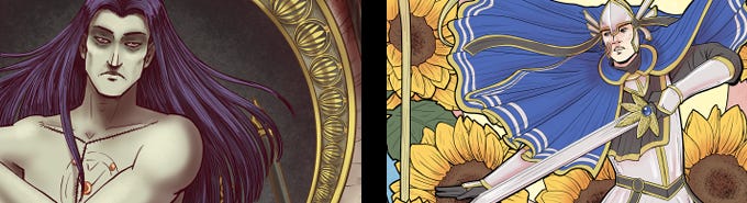
I’m trying to decide which promo image to use for Sacrimony #9, Dark or Light. I keep going back and forth between two versions. I like both for completely different reasons, which is making this harder than expected.
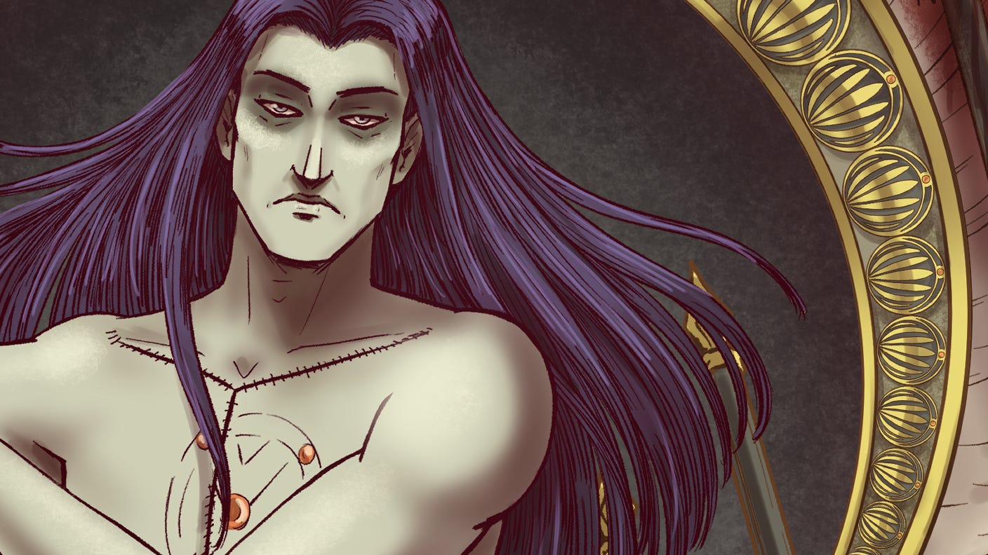
You’ve seen me use this one already. It’s the standard cover, and I love the intense close-up of Ravanna’s resting bitch face and the bit of the detailed border. At the same time, I keep wondering how it might come across to someone new. Is it a little too spooky? Would it pull people in, or accidentally push them away? (I promise, it’s spot-on for the issue).
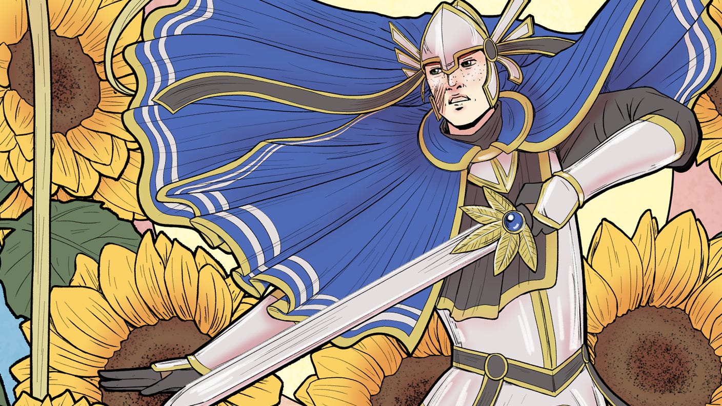
This one is going to be for a holofoil variant cover but it also makes a really pretty promo image. I like that it’s bright and has lots of details. But I also worry that when it’s shrunk down into a tiny thumbnail, a lot of those details might get lost and the impact won’t be as strong. It’s also not a much of an accurate representation of the tone of the issue but it’s pretty…
So now I’m stuck.
I’m curious which one actually makes you want to click and learn more.
I’m really excited that Sacrimony #9 is finally happening next month. This issue has some of the best art I’ve done so far, and I put a lot of time and effort into making it look exactly how I’ve always imagined the series should feel. It’s one I’m especially proud of, and I really can’t wait to share it.

If you’d like to follow the upcoming campaign, you can do that here:
https://www.kickstarter.com/projects/msorcier/sacrimony-1-9
Talk soon,
-M🖤
I really like the blue and yellow playing off each other in the light version. It also is giving a lot of Art Nouveau vibes, which I feel could attract people to look -- it will pop among all the other comic projects.
The light one with the action pose is really nice. The people here at this moving party liked the Light one the most.
Personally I like the Dark one because of the complimentary colors.
Both are visually appealing.